When Eiffel 65 released their Europop classic Blue in 1998, you may have understandably been mistaken in thinking they were reminiscing about living in hospital digs as medical students. But this can’t possibly be the case because hospitals sometimes use other colours. There’s white coats and theatre greens. Ahh… the sterile yet soothing colour palette of healthcare.
Learning objectives
1. Explore the use of colour in healthcare imagery
2. Reflect how the use of colour in healthcare imagery has changed with time
3. Consider whether the colour psychology used in healthcare imagery can unfairly influence patient expectation
In a previous post we examined how art and exposure to some colours may influence health outcomes. Now we’re going to explore how healthcare services use colours to project themselves to patients and staff.
Questions
What colours do healthcare logos and websites use?
Try googling some famous healthcare systems/hospitals and note any common themes in the imagery used on their websites
Apart from a minority of exceptions, you may have noted that most healthcare logos and websites are dominated by a sea of blue, green and white. In colour psychology, these are apparently associated with traits such as trustworthiness, calmness and cleanliness.
A good example of how colour is used in healthcare branding is that of the National Health Service (NHS). There is even identity guidance on using colours for the plethora organisations that work within it:
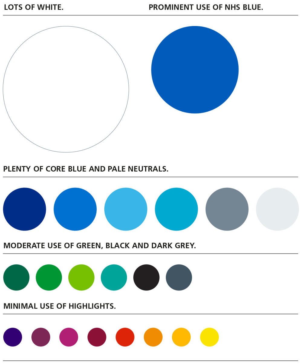
Image from https://www.england.nhs.uk/nhsidentity/identity-guidelines/colours/
It didn’t always used to be this way. In the middle ages, barber surgeons advertised their bloodletting expertise to the public via the barber pole. It’s been said that the red on a barber pole represents arterial blood, the blue venous blood and the rotation of the pole the circulation. The pole itself represented the staff the patient could grip onto during the presumably painful procedure to encourage blood flow.
As the professions separated, the surgeons kept the white and the red stripes dispensing with the blue (although the blue remains particularly prevalent in the US perhaps as a homage to the colours of their flag). Another thought is that the white and red stripes represented the clean and blood stained bandages left outside the shop to dry, the wind creating the spiral appearance.
Either way, barber’s poles are now only generally seen outside barbershops.
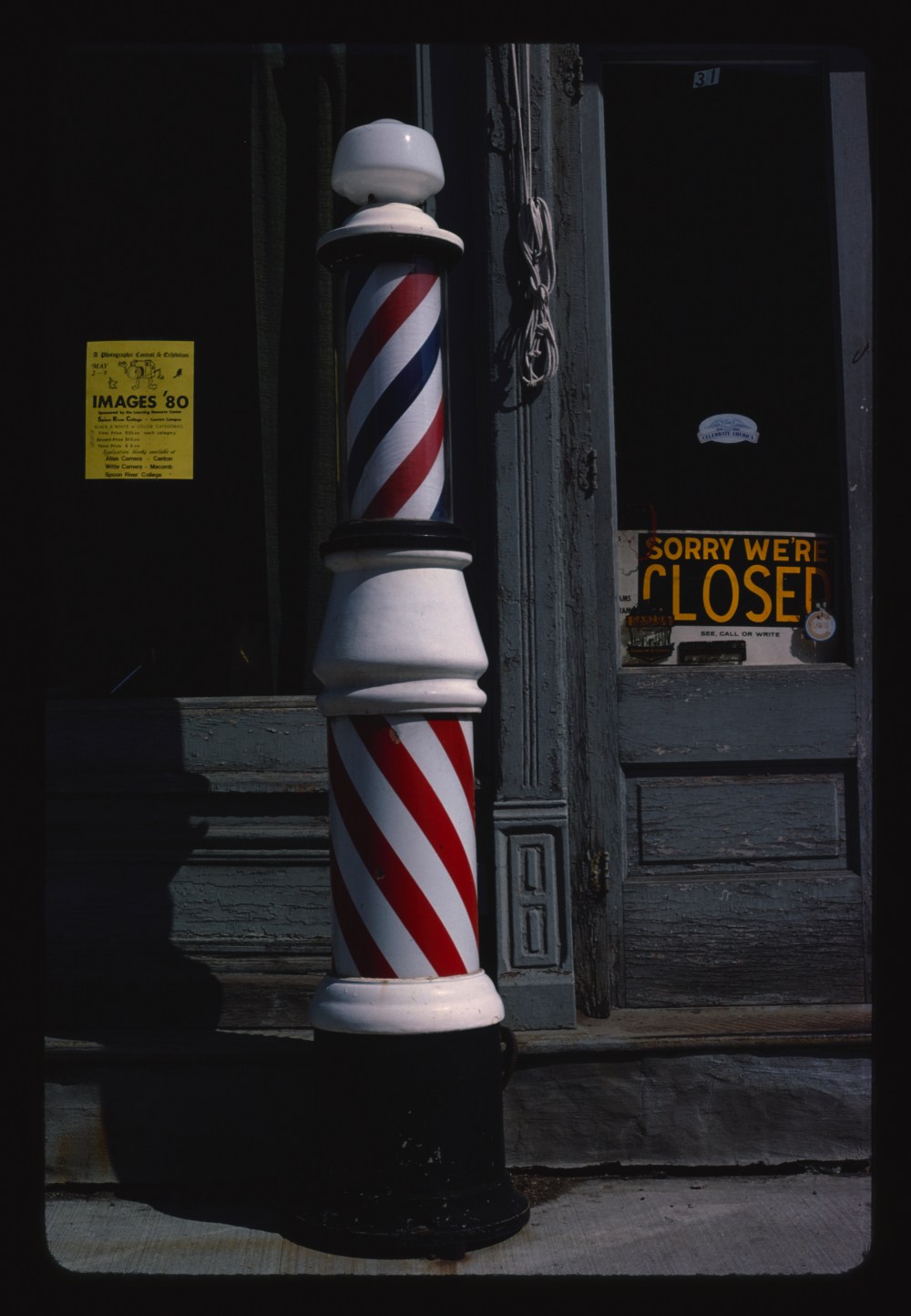
Image from https://commons.wikimedia.org/wiki/File:Barber_pole,_Canton,_Illinois_LCCN2017706848.tif
Questions
Where do you now see the colour red in healthcare images?
In my experience, red is now generally confined to emergency healthcare, such as accident and emergency departments or ambulance services. Instead of the apparent calmness that the colour blue creates, in an emergency setting there is an imperative for urgency that red may represent. Perhaps of more importance, there has be a trade-off between the feeling a colour may provide against the ease at which it can be seen.

Emergency vehicles in Europe comply with CEN 1789, a European Union standard for ambulances. The specified colour scheme involves Battenberg yellow and green markings. It has been noted that the human eye responds particularly well to the Euro Yellow RAL 1016 colour. It’s also a colour not routinely seen on non-emergency vehicles, which adds to its distinctiveness.


Questions
What colours do the emergency services in your country use?
But surely there’s lots of red in surgical theatre, I mean, all that blood and all… I suppose the more modern parallel to the barber pole would be the blood splattered on white theatre scrubs and the surgical team subsequently parading their resplendent gowns in the hospital canteen.
The main problem with this description is that we don’t really see white theatre scrubs anymore. It seems that white scrubs may have been too distracting and harsh on the eye, so they were switched to green and blue. White scrubs are also harder to clean without discolouring them over time, making them appear dirty.
Although you can now find staff wearing burgundy scrubs in some hospitals, it appears that by the year 2365, Federation doctors have decided that going all out red (patients included) while operating is absolutely fine. A future surgeon must have discovered that it’s harder to notice human red blood on red scrubs, thus in turn allowing their supposed non-invasive techniques achieve legendary status throughout the known universe.
Questions
What colour uniform (if any) do you wear to work?
What happened to your old white lab coat?
With modern medicine, there is an expectation that the butchery of the past has been dispensed with. There is no doubt that healthcare has advanced. However, as many doctors know, medicine and surgery can still be very brutal at times. Should we as a profession be more open about this with our patients?
Can healthcare imagery help convey the message that often healthcare isn’t calm and is instead a complex and messy business. And business is a key word here; patients will be attracted to organisations that convey a message of calm during what can be a very vulnerable time for them. Clinicians should reflect however whether a message of calm is organisationally accurate and if such a message really helping or hindering them take care of patients in reality.
It’s interesting to reflect on how modern medicine appears to avoid the colour red perhaps instinctively the most ‘natural’ colour associated with health and vitality. Should we use a more varied colour palette in healthcare? Please consider sharing your thoughts in the comments section below.
Summary
Health, wellbeing and the natural world are increasingly being bundled together. Lots of blues and greens are common in the imagery associated with these topics. It’s interesting to reflect on how modern medicine appears to avoid the colour red except in emergencies yet in the past, red was utilised to advertise skill and expertise in health. Apart from healthcare advertising, the colour palette expands when we have to consider the helpful or unhelpful distracting effects of some colours in the healthcare setting.
Further resources
NHS Identity Guidelines: Colours
https://www.england.nhs.uk/nhsidentity/identity-guidelines/colours/
